MAKING & CURATING
On 10th October 2017, I visited the Harry Potter graphic art exhibit on Soho, London. It was packed full of original designs of book covers, newspaper front pages, and other props found through the film series.
It was very interesting to learn about the techniques used to achieve the magical look for the book covers. For example, the foiling was done by hand. Also I learnt about how the books were made, as they were designed, printed, and then sent to be professionally scruffed up, in order for them to look used for many years.
I have included some images of my visit.
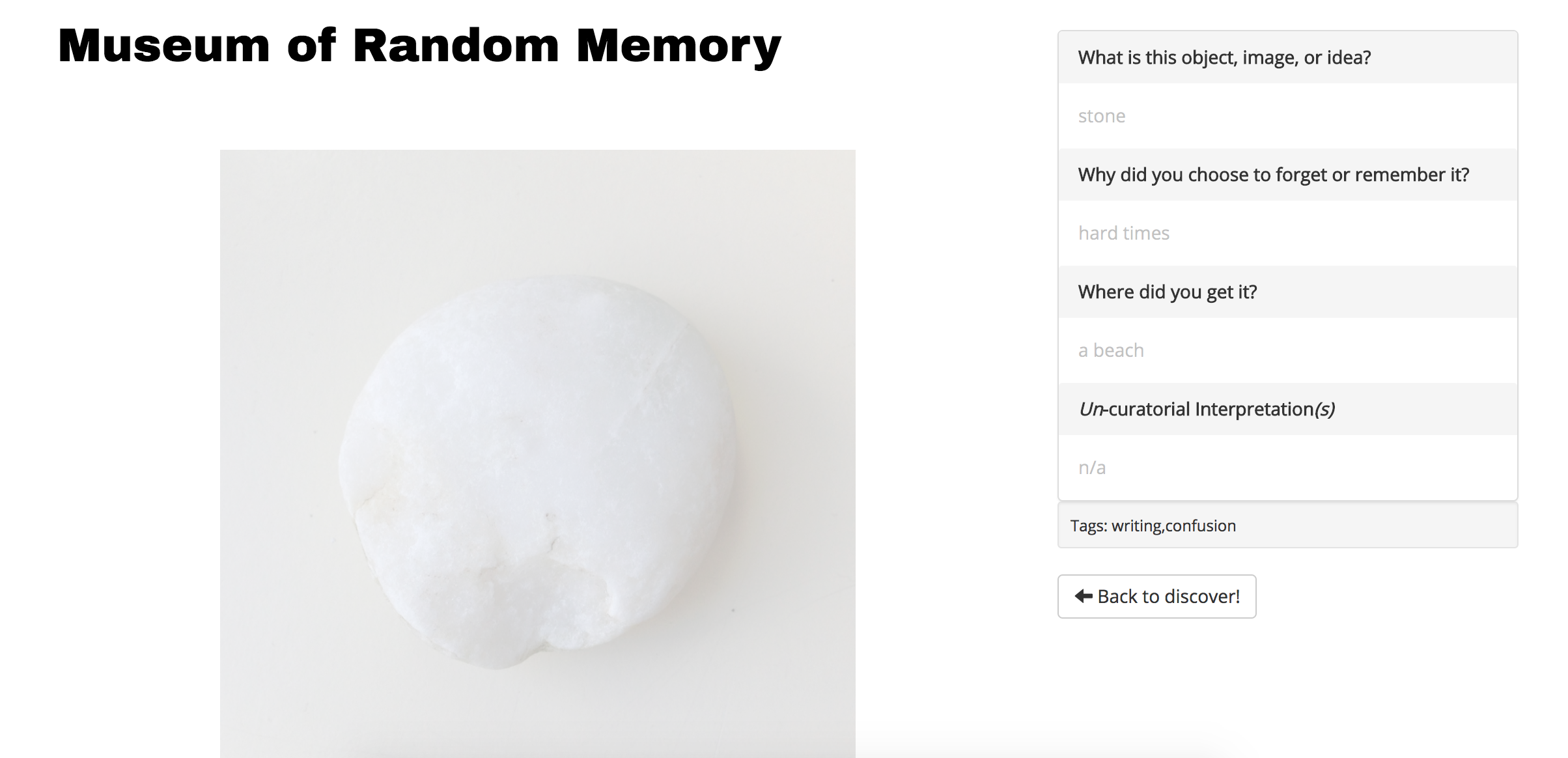
An archive I am interested in choosing for my project is the Museum of Random memories.
This is a website with which people 'donate' a memory or you can 'discover' people's memories. I felt that this was very interesting as the memories are either very personal or very basic that happen to everyone daily. There is a toggle at the top which you can slide to see which memories people wanted to remember or ones that people wanted to forget, adding to how it is quite personal. It allows you to learn a little about the person.
Whilst playing around with the site, I found that you can look at the memories individually. This allowed you to look at the questions asked about the photo added and the person's answers to them, giving you more information about the memory.
11/10/2017
On October 12th we were taken on a trip to see an archive of objects. This was the Delfina Foundation's exhibition 'Unperformed Objects' by Geumhyung Jeong. The exhibition was a room filled with objects collected over ten years. They were used for either performance purposes or that were intended for performances but never made it. They mostly consisted of everyday objects, mannequins, and breathing apparatuses. There were also televisions showing videos of Jeong using some of the objects to rehearse.In the videos we saw a ladder with a mannequin head on it, and Jeong would lay on the floor and use the object to perform semi sexual acts. We believed that the point of this was that men are seen to imagine women as objects, and so she is flipping this reality and making the male an actual object and so she is using them. We don't know if this is really what she was trying to get across, but it's our own thoughts and ideas that we left with.
For a lecture, we were taken to Stuart Hall's library in Shoreditch, London. This is a special collections library and holds over 10,000 books, DVDs, CDs, and films/videos. The collection mainly focuses on British and European contemporary art with an African/ African-American heritage.
Once we were there, we were given a talk about the library, as well as shown a collection of books that we may have been interested in for our research. We were then allowed to look through the archive ourselves and pick some books we felt were similar in either their art, or text content. The people I was working with decided to pick a collection of books based on their artwork that was influenced by geography and maps. They were also all asian based artists. I enjoyed looking through the archive, and finding out what other artists have done with this library, such as a walk through that you listen to, to discover the story. However, I did not think of anything that I could do with this archive and so I am thinking of staying with the Museum of Random Memory.
Readings
Do artifacts have politics?
by Langdon Winner
To summarise, the reading includes the ideas that buildings, structures, and systems can embody power and authority. We can see this from Winner's example of bridges being built too low around Long Island, stopping public busses from passing underneath. This was seen as only allowing the middle and upper classes getting to enjoy the beaches on the other side of the bridges, as they had their own vehicles.
Another example would be the tomato harvesting machine. This managed to pick tomatoes quickly and efficiently, however was very expensive. Bigger companies were able to buy the machines, although smaller businesses could not, and so they were put out of business, which is seen as political.
By the end of the piece Winner goes on to talk of how these great machines could be a bigger part in our society and could end up running the politics, which may cause a lot of danger in the future.
The Power of Display
by Mary Anne Staniszewski
Staniszewski sees installations as creations that exhibit values, aesthetics, and politics. In this piece, we are shown over 200 images of art installations at The Museum of Modern Art in New York. Staniszewski analyses display techniques used in shop windows, museums, art galleries, and exhibitions. In this, she talks of the meanings behind these displays.
Relational Aesthetics
by Nicolas Bourriaud
In the beginning of this reading, Bourriaud asks the question, how are we supposed to deconstruct an artists work? Is it linked to some problems that we see in society? Are they linked to history and culture? or are they linked to the artist's own problems?
A quote I liked from this piece was "We feel meagre and helpless when faced with the electronic media, theme parks, and user-friendly places, and the spread of compatible forms of sociability..." I feel like this is still true in the modern world as the media can still be very frightening and dangerous for specific people. For example, it can make young girls feel worthless, and lonely even though they have access to their friends 24/7.
Bourriaud also talks of how "the work of art shows not only its manufacturing and production process,... but also the creative behaviour of the artist." His example is that all works made by Jackson Pollock links the flow of the paint to his behaviour as an artist.
Thinking Contemporary Curating
by Terry Smith
From this reading Smith helps us to understand that curating is no longer associated with museum space. He talks of how curatorial practice isn't limited to exhibition spaces anymore and the artist isn't just someone who sets up exhibitions. They come up with new ideas and concepts, and analysing connections. Curators are starting to go between artists and art consumers and give their own thoughts on contemporary art and where it fits with the world.
With this archive, I want to try to come up with my own piece using memory. Firstly, I need a research question. My question revolves around good memories and bad memories. If someone was asked to think of they're most vivid memory, what would it be? Are emotions and memories connected? I believe that if they thought of a good one then this would show that they're happy and content, however, if they instantly think of something bad then this would show a lot about their past or how they're feeling at that very moment. To do this project I would like to curate a collection of memories from people. They will also have a short story surrounding the memory, and a brief description on how that person is feeling at that moment.
Visits
Project
Group Project
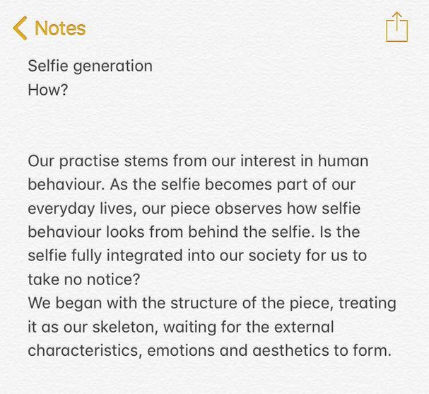
After showing my project idea in a presentation, the class was able to create their own groups with people who have similar ideas. I decided to join Sakuna, Anastasia, and Demel. All of our projects were about the self and self-love. These ideas were mixed together, and so we wanted to dive into selfies and how they maybe affect us, and what it takes to create the perfect selfie. To do this we wanted to put together a collection of images. This would consist of a person's selfie, and then an image of the person taking a selfie. This would show their surroundings, such as a girl surrounded by make-up in a dark bedroom on her own. Or someone taking a selfie with a friend whilst enjoying a day out. We want it to be a study in human behaviour and self-love.
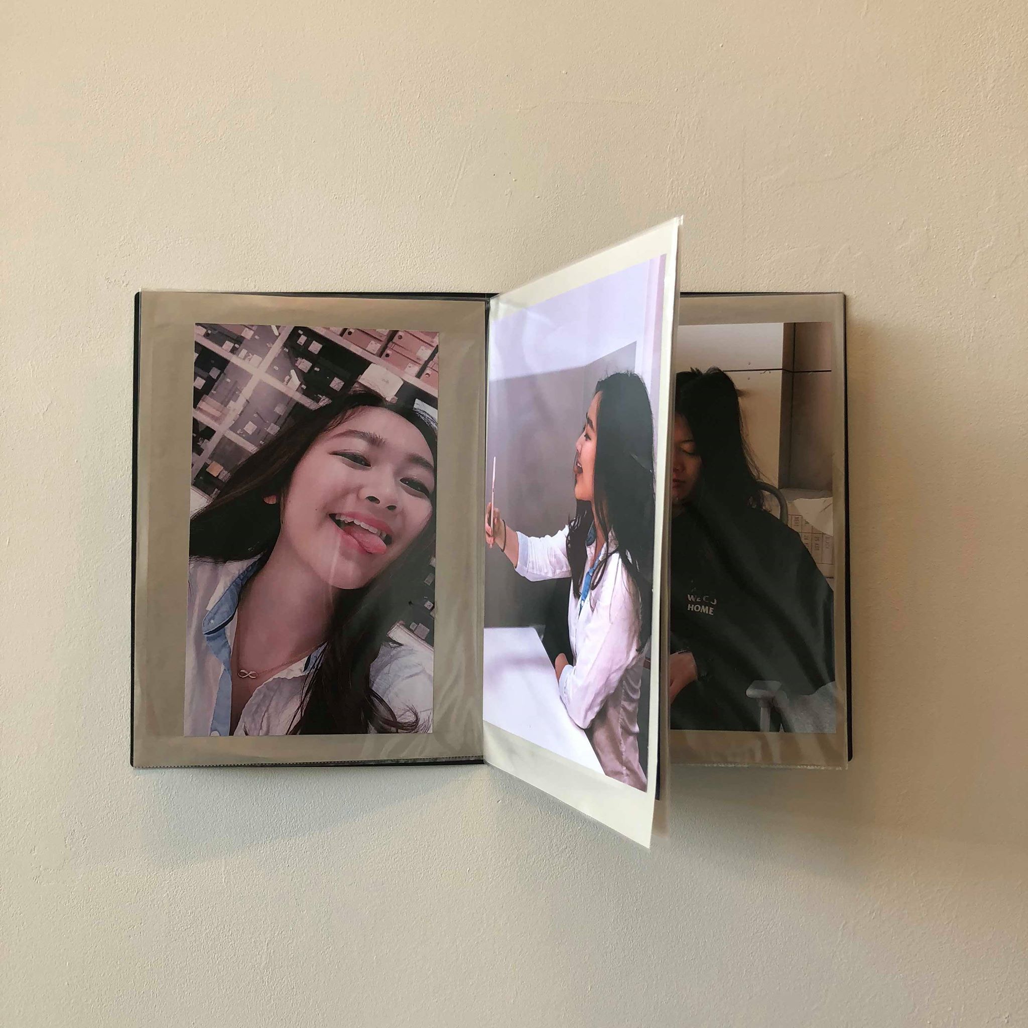
During our first meeting as a group, we all gave our ideas and decided on a type of flip book that would need to be fitted to the wall. This would allow the audience to flip through the book looking at the different selfies and the behind the scenes of that person taking the selfie. These images would also be A3 size, allowing the audience to see the detail and it gives a good quality. The piece would be hung at eye level. Depending on how many pages would be in the flip book, meant that we would have many or images or not a lot of images. The layout of the book, when open on a two page spread, would show the selfie on one page and then the behind the selfie on the other. This means it would show you the process after the final image that was taken.
We drew up some plans for this idea to show how the piece would work and explain how it would fix to the wall.
After looking into ways we could build our piece, we discovered that it was just too complex and expensive for us to achieve. This meant that we would have to think of new ideas for our images. We knew that as a group we still wanted to take our own images and display them on a wall, however, we weren't sure how. Until we found that with the name "Behind the Selfie', we could put images behind other images. We would put the behind the selfie image on the wall and then attach the actual selfie on top. This could be attached by velcro, making it easier for the audience to take off the front image, revealing what is behind. This would make our work still interactive, and relates more to the name we chose.
After considering this new idea for our piece, we later thought of the idea of just having the two images side by side. This would show the process of someone taking a selfie. We figured out that putting the selfies on top of the behind image wouldn't work, due to the selfie images being a lot thinner. This meant the behind image wouldn't be totally hidden. Putting the two images side by side helped to relate back top our artist statement that talks of how we wanted to show human behaviour with our images, and to also show how weird and awkward it can sometimes be when watching someone take a selfie of themselves.
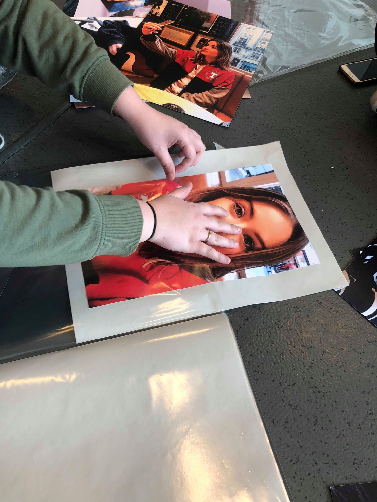
The process of making our piece wasn't too difficult. As we had taken our images using phone cameras, we realised that maybe the quality may not be as good on a large A3 sheet , due to the image needing to be stretched. Although, after looking at the images on a computer screen, we decided to try it anyway to see whether the printing would work, or if we needed to change the sizes of our images. We printed the images on thick A3 paper, and we were all happy with the quality of the images. After printing we were left with 12 images, 6 selfies, and 6 behind the selfie images.
Next we needed to cut the images down to the sizes we wanted. As the selfies were in a phone portrait size, they were skinny and long. However, the images of the people taking the selfie were wider, due to more being fit into frame. This problem was easily fixed by cutting all the selfie images to the same size, and all of the behind images to the same size too. Although, we made sure that all images were cut to the same height because if they were all different this wouldn't look aesthetically pleasing.
The next step was to hang the images on the wall, side by side.
When going to set up our piece, we found that the space we requested had been changed due to us changing our idea. This meant instead of a whole small wall, we only had half. We thought that even though we had changed our plans, we were still able to use the space we needed so that all the images could fit next to each other. However, when testing this with the small wall, it seemed that only four sets of images could be used, cutting down our piece, which we didn't want to do.
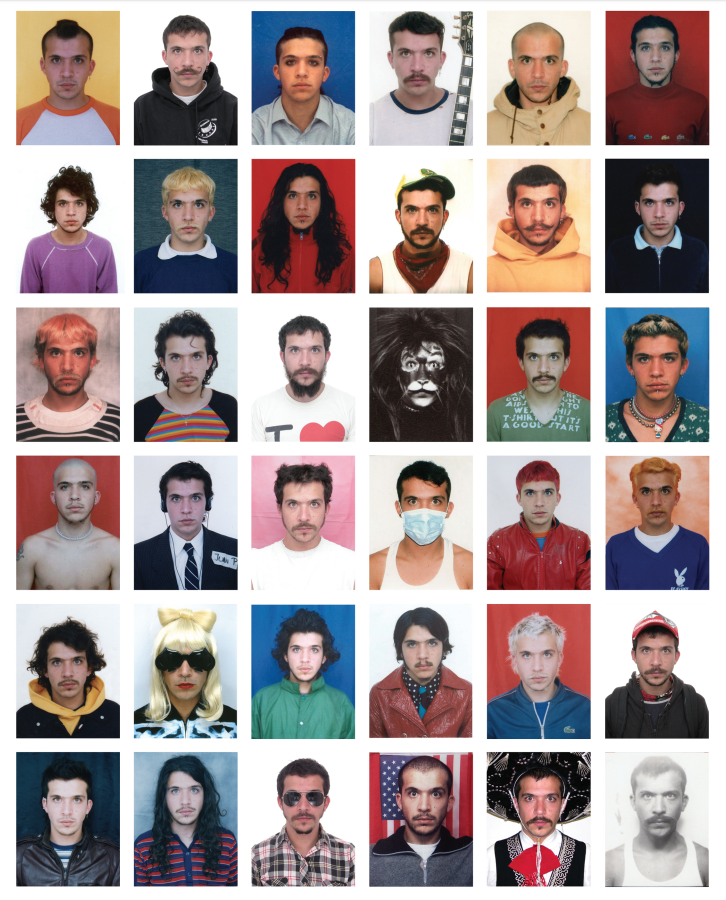
This meant we had a problem. Someone outside of our group suggested we turn our prints into a book. So with our limited time, we bought a portfolio book and striped some of the pages so that we had the amount we needed. The prints were then glued onto beige paper and put into the portfolio.
The next problem was how the portfolio would be displayed. We thought of either putting the portfolio on a stand or somehow attaching it to the wall, just like our original idea. We decided to attach it to the wall as we found that we could use nails, making it secure. After it was nailed to the wall, we were happy with the outcome, although wasn't the idea we truly wanted to achieve.
INSPIRATION
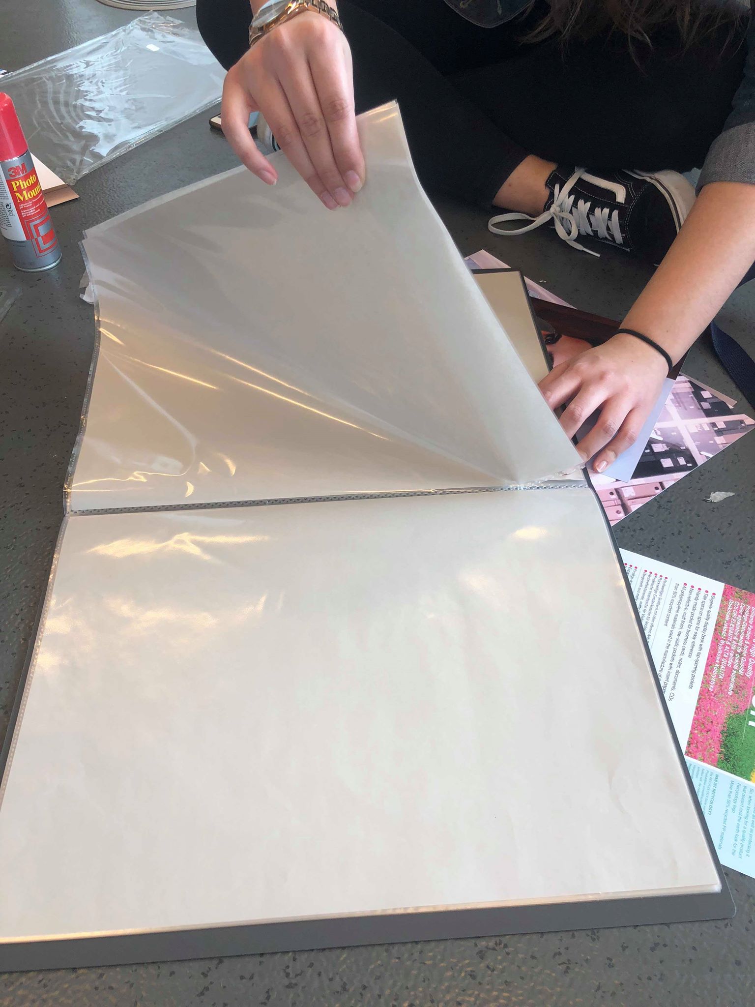
We were inspired mainly by two artists, Andy Warhol, and Juan Pablo Echeverris. Our work was based on their use of self portraits used in their art. Also a member of the group had recently visited an exhibition surrounding the subject of selfies. This included the work of Echeverris. The work included a collage of images of front facing people, that were both serious and funny.